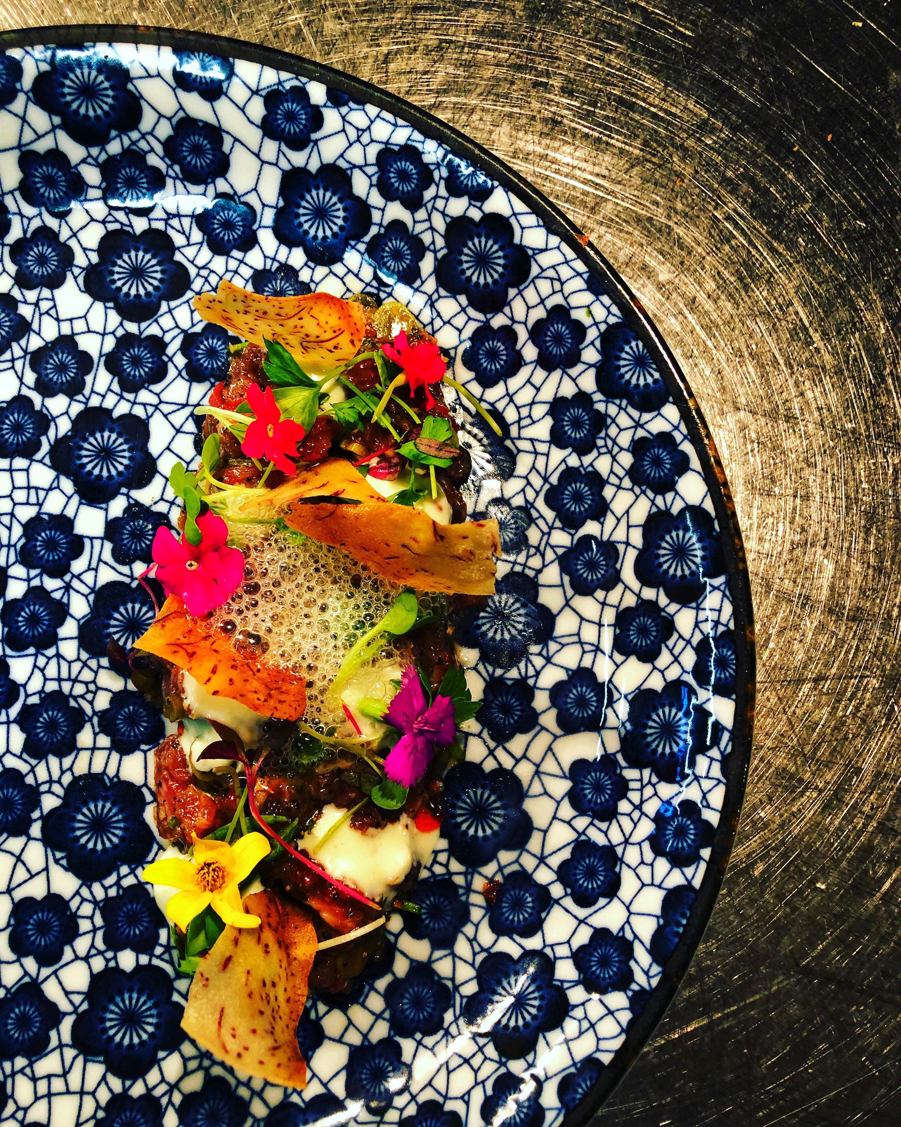
Plates nice, but not for a dish like this. Heavy clashing, and I can’t see anything. Although turning the saturation way up didn’t help either.
cash_grass_or_ass on
With that many elements in the dish, a solid colour plate with no design would offer a better contrast.
My eyes hurt looking at the food 😐 and the plate.
Edit: though I appreciate your modernist style, I prescribe to the, “less is more” paradigm. I think you can remove a few garnishes here. I’m not sure how edible flowers contribute to the flavour of tartare. It looks like you got pea shoots and parsley, do you really need both?
I like the foam and love the taro chips.
domionfire on
Plate clearly shows your artistic side and skill. however I can’t stop thinking it’s the culinary equivalent of butters bike for the south park bike parade
Yummy_me_ on
Looks beautiful but this foam, bubble looking things always makes me think of baby’s foamy spit 🤢
dysfunkti0n on
OP explain what I’m looking at please.
Mundane-School-8507 on
Ahh true wished I plated this beef tartare with a solid colour instead..also showing the beef more too. Anyway the micro herbs I’ve used are beets, cilantro, and sorrel 🙂
heck_naw on
more pretty things in one place does not necessarily add up to an even prettier thing. this desperately needs negative space to highlight some of the beautiful elements on (and including) the plate.
kelleehh on
The plate reminds me of Wetherspoons. Your food looks a lot better than what they serve though!
MmasterOfPuppets on
Don’t forget to water it!
Seriously though that is a beautiful plate. Would have liked to see an extra picture or two with the beef🤤
James_Bong on
Needs more edible flowers.
TitoMLeibowitz on
Plate itself is too busy and overshadows the food
p5ycho29 on
Where is the beef tartare? Is there egg? Or is this just raw beef with salad on it.
Appropriate_Yam7324 on
The plate is too busy but everything else is absolutely beautiful
aubaub on
Way too busy. Difficult to see the food
Anfie22 on
Why do you have flowers on your food?
maiuhhh on
so busy idk where to look… the foam looks great tho
Rl3otic on
Now thats a beautiful tartar what kind of meat are you using?
jonet333 on
It looks absolutely beautiful but I had a hard time locating the beef.

20 Comments
This plate is absolutely gorgeous!!
The fluff looks nice, but where’s the beef?!
Plates nice, but not for a dish like this. Heavy clashing, and I can’t see anything. Although turning the saturation way up didn’t help either.
With that many elements in the dish, a solid colour plate with no design would offer a better contrast.
My eyes hurt looking at the food 😐 and the plate.
Edit: though I appreciate your modernist style, I prescribe to the, “less is more” paradigm. I think you can remove a few garnishes here. I’m not sure how edible flowers contribute to the flavour of tartare. It looks like you got pea shoots and parsley, do you really need both?
I like the foam and love the taro chips.
Plate clearly shows your artistic side and skill. however I can’t stop thinking it’s the culinary equivalent of butters bike for the south park bike parade
Looks beautiful but this foam, bubble looking things always makes me think of baby’s foamy spit 🤢
OP explain what I’m looking at please.
Ahh true wished I plated this beef tartare with a solid colour instead..also showing the beef more too. Anyway the micro herbs I’ve used are beets, cilantro, and sorrel 🙂
more pretty things in one place does not necessarily add up to an even prettier thing. this desperately needs negative space to highlight some of the beautiful elements on (and including) the plate.
The plate reminds me of Wetherspoons. Your food looks a lot better than what they serve though!
Don’t forget to water it!
Seriously though that is a beautiful plate. Would have liked to see an extra picture or two with the beef🤤
Needs more edible flowers.
Plate itself is too busy and overshadows the food
Where is the beef tartare? Is there egg? Or is this just raw beef with salad on it.
The plate is too busy but everything else is absolutely beautiful
Way too busy. Difficult to see the food
Why do you have flowers on your food?
so busy idk where to look… the foam looks great tho
Now thats a beautiful tartar what kind of meat are you using?
It looks absolutely beautiful but I had a hard time locating the beef.