
Culinary school little guy trying out different things and id like some tips on bettering my plating.
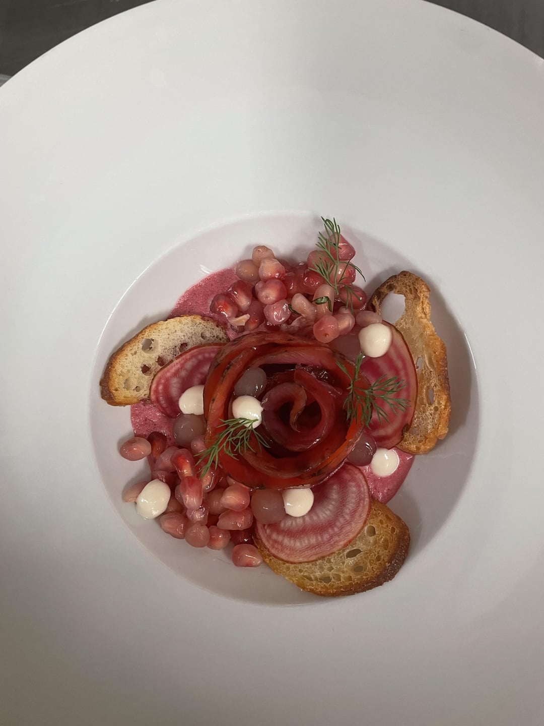
1. Rainbow trout gravlax with beet juice, grapefruit gel, garlic sour cream, basilic pomegranate, chioga beets and beet espuma
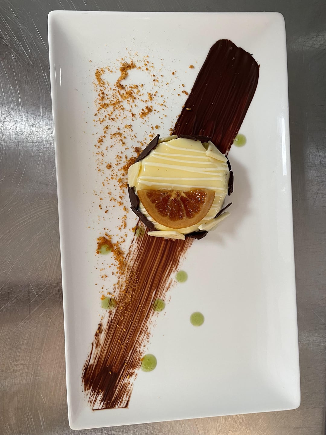
2. Orange white chocolate cheese cake, confit orange, mint gel, orange « powder »
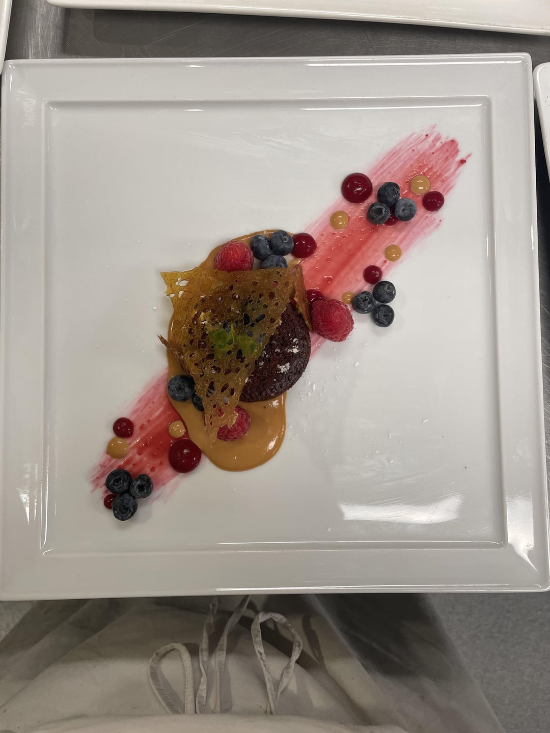
3. Chocolate fondant cake, caramel sauce, raspberry purée, caramel tuile and fruits
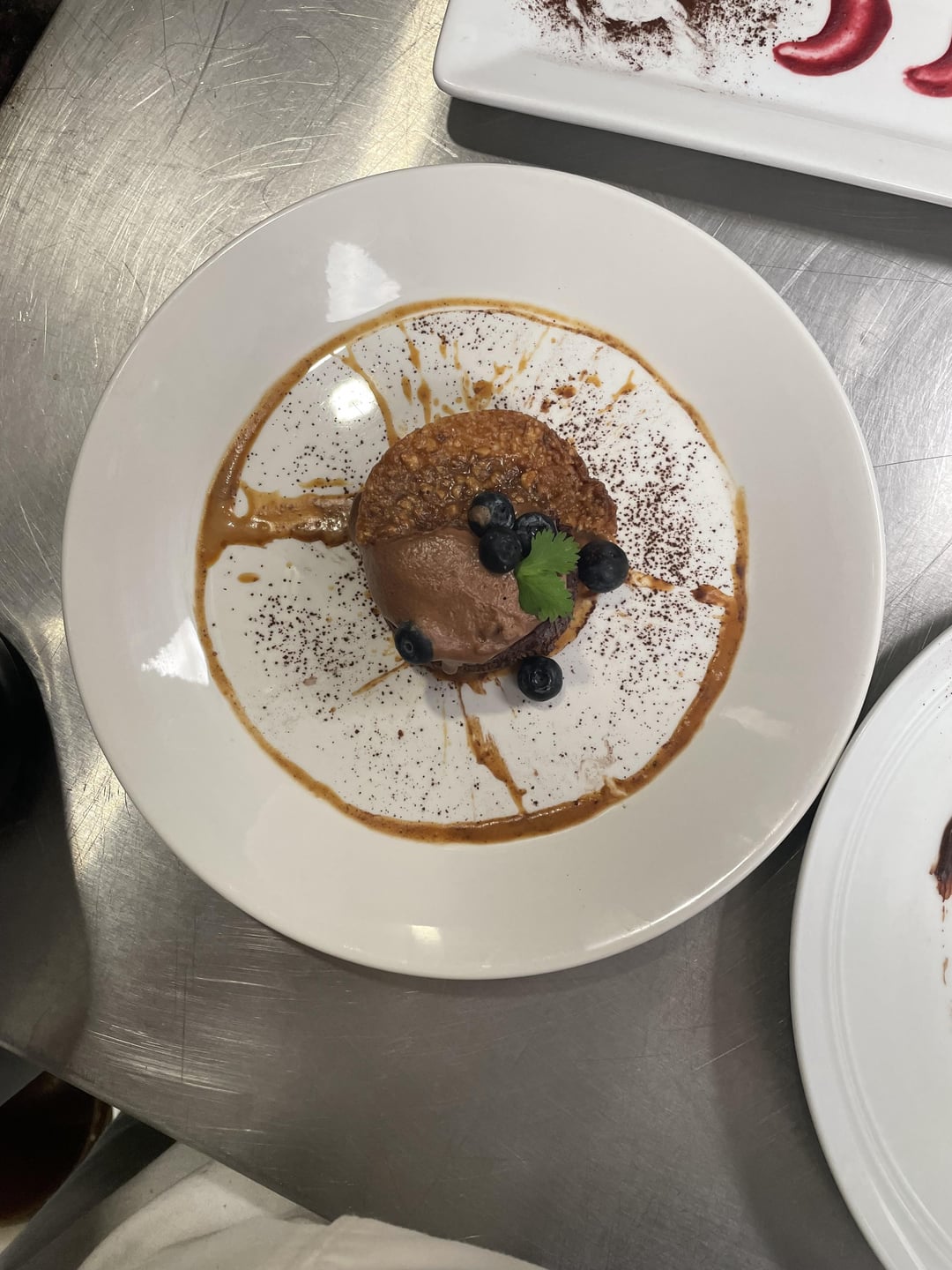
4.Same thing as 3 without the raspberry purée but with chocolate mousse quennelle
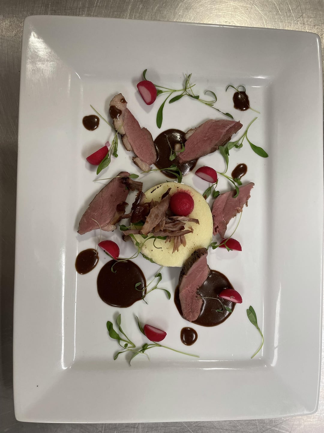
5. Pulled duck « paté chinois », smoked duck, glace and pickled radish.
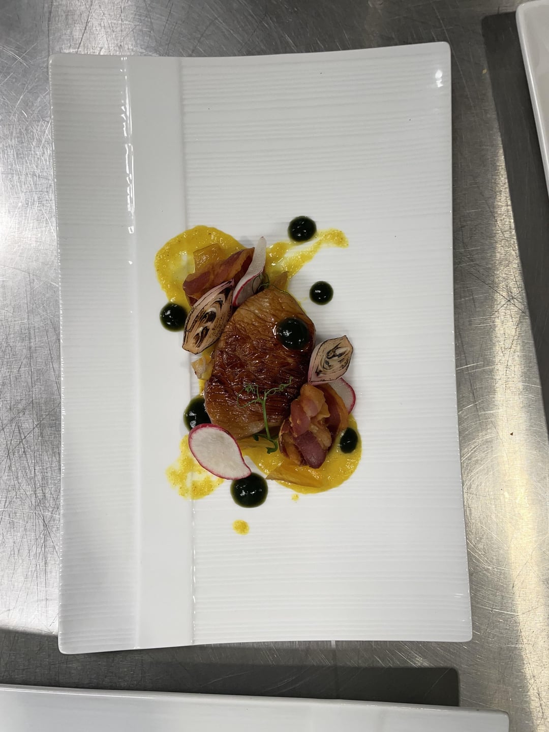
6. Honey glazed porc chop, burnt shallot, bacon, thyme gel and corn purée
by milk_is_cereal_sauce
25 Comments
Plates are tight but dated to all hell. The brush across the plate, 2005? The duck looks just strewn about, tasty I’m sure but just kinda placed. First plate is a good 6.5/10 and looks tasty. The fondant reminds me of the “oops I dropped the lemon tart” plate from over a decade ago. Last plate could be nice but the gel…idk.
I just don’t think that anything brown should be brushed across a white plate.
2 makes me giggle
Tossed at the plate from across the kitchen
Overall, good stuff
I love them! They have a little bit to the past and I find them really interesting and beautiful
I agree that the brushed sauce looks offputting and dated, but you’re pretty close to a good dish in the ideas of 3 and 4. Not going to lie, I kind of like the circular, wheel situation even though I want to hate it. Take the good pieces of 3 and 4 and combine them. Drop the brushed sauce and powdered whatever, use the negative space in your wheel for berries/mint/tuile and drop the sauce tightly under the cake or on top.
It may just be the photography, but it looks like the dishes would benefit from more height too. You could definitely try to tighten up the plates and add more negative space, pretty close to good looking plating with a few quick fixes.
We’ve all heard of side-boob but take plating photos from straight down.
Why is that?
For #3 – Groups of three is a warning sign for poison ivy, don’t do that.
For #5 – Why move pieces of meat all over like designing a tapestry or wallpaper. Keep it simple.
To me it’s very reminiscent of early 2000s plating. This happened to me to and it’s because that’s the last time your instructors actually worked in restaurants. If you want some cool plating inspiration I would look up a restaurant called Contra as a starting point. Everything is moving towards much simpler presentation on the savory side. Pastry is a different beast
i like all except 5&6. 5 is too messy 6 too empty
All of these dishes look like they taste great, but are just put together in strange ways. think about how you want your guest to eat the dish when you’re plating, the size of your components, and look up some fine dining plates for inspiration. Your best plate here is the last one, in my opinion, but I would strain that sauce, and emulsify with some cold butter to give it better structure and shine. You’ve got good bones here, just needs some tweaks. Also ditch the square and rectangle plates. They just look clunky 9 times out of 10.
1. 6/10
2. 2/10 for poop
3. 4/10 what is the runny poop part of this? I hate it. Also I don’t like this plate. You have a lot of plates that are too big, tighten up the “canvas” and decrease all the negative space and spread.
4. 3/10 for poop, abundant, negative space, shitty color palette (pun intended, sigh).
5. 6/10Smaller plate, maybe different shape, current plate if possible(I know you probably only have the school plates).
6. 5/10 Wrong plate choice, shitty color palette.
You’re doing great! Keep going, please keep posting.
If you have time, can you tell me how they teach plating in culinary school?
So your plating is very dated and is reminiscent of culinary school practice plating.
As everyone has said, don’t smear- it’s unappealing.
Plate 1: this dish would benefit from either crostinis on the side or better yet, cut medium dice croutons. Be conscious that your Espuma may get deflated after covering it up with other components and the time it takes to get to guest.
Plate 2: besides the smear, This dish should be plated on a small round. May sure all garnish make sense with the dish and add to the eating experience with flavor rather than take away. Less is more in some instances and the tart would be beautiful on its own.
Plate 3: again the plate is too large and you have another schmear that is not sexy. I believe this would benefit from a shallow bow.
Plate 4: if I didn’t read what it was I would have no idea. Why are you garnishing with cilantro and blueberries? I cannot state it enough that each ingredient on the plate should be edible and have a purpose. This plate looks incredibly messy. The sauce looks splattered and with the cocoa powder it’s like beating a dead horse with a stick. This is my least favorite of all your plates.
I highly recommend looking at food photography from Pinterest, Reddit, Instagram, StarChefs or Great British Chefs and copy platting styles till you form your own style and voice on a plate.
Plate 5: the duck is dry, your micro greens are bruised and wilting and your sauce work is loose and placed without purpose. Firstly, I use a spray bottle of cold water and lemon juice or even EVOO to spray micros and herbs prior to plating to make them shine. However, they should also be washed in cold water and dried gently to avoid the dead lawn clippings look that yours have. I cannot distinguish if this is a savory course or a dessert intermezzo. Also, the shredded duck on top of your cheesecake like disc is out of place. I see what vision you had, but the execution is lacking.
Plate 6: this suffers from the actual choice in plate. As a chef, it seems that this dish focuses on the garnishes and plating more than the actual pork chop, which looks dry. But it is a promising concept. If you rework this dish with a different plate and a more experienced hand- you could have something restaurant quality.
I may have been forward but do not be discouraged. Honest feedback and criticism will help you grow. You are young and in culinary school. You have much growth to be made but if you start looking at other chefs platings and food photography you will gain a better understanding.
Good luck and keep striving for excellence.
All 5/10 based on plating alone. It gives 1970’s vibes, long plates are atrocious, shmears are lame. Best thing you can do my friend is get some actual nice plates.
Wow awesome work!
Congrats chef!
The best I’ve seen on here in forever.
How honest would you like people to be?
The only reason to do cool shit with sauces (like use a paint brush) it to make things look better than they are. Ditch it. Smaller purée dots might be better
Watch some videos about recent 3 star restaurants Nd take inspiration. This all looks very early 90’s
I rate them as luxury and expensive. Obviously out of my reach. Which in itself is a compliment.
Maybe for the 3rd slide could you place the tuile in tween some of the fruits instead of covering the cake ?
Looks great I would eat them all.
Keep it going! My only advice would be put more emphasis on the components and less on the composition. People who know and spend on good food are usually looking for cooked to order quality along with premium ingredients and then thoughtful plating
Those pomegranate seeds in #1 look like absolute shit. Which means they will taste like shit. That one is a SERIOUS fail. If those seeds are not dark red, they shouldn’t go in the dish. I don’t want to drag you, but that never should make it to the diner.
I went no further than the skid mark in #2, because I think you might be trolling.
Fucking sick (I needed 25 characters to post)
I’ve seen that red and brown smear in many park bathroom stalls
I feel like the meat (looks like duck) on the 5th picture is at risk of getting cold on that plate. You could heat the plate, but the sauce will likely run.
I say keep it as one piece or keep the cuts together so they can hold temp longer.