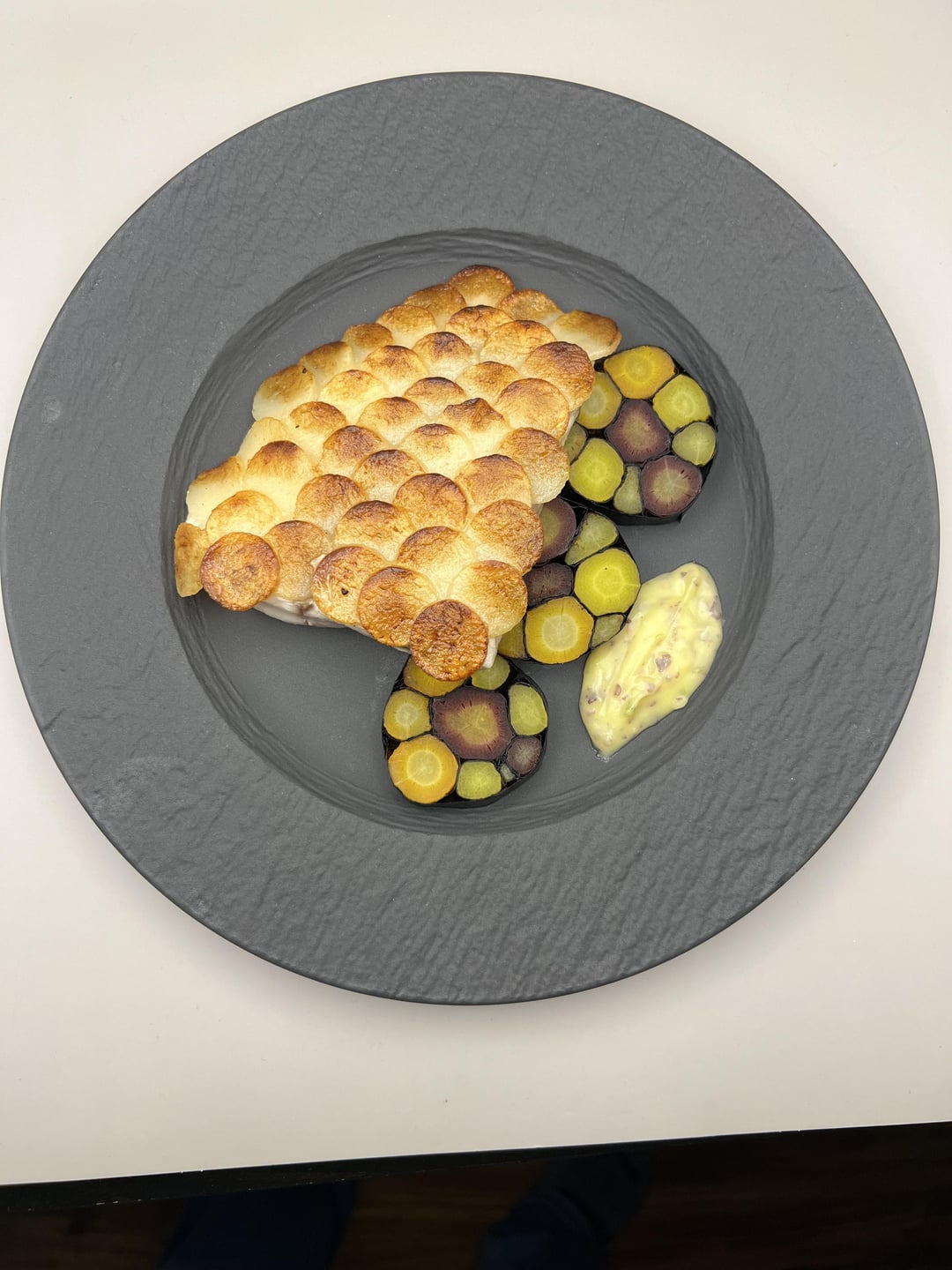
Never seen a non-protein mosaic before. Could you explain how you accomplished that?
fddfgs on
Some really cool techniques on display but something about it all just seems alien to me, like I’m not looking at actual food any more. Maybe lift the fish up a bit so that some is visible under the potato.
I love the carrot mosaic but in combination with the potato scale it’s making my eyes blur, maybe make the scale a different size?
PureBee4900 on
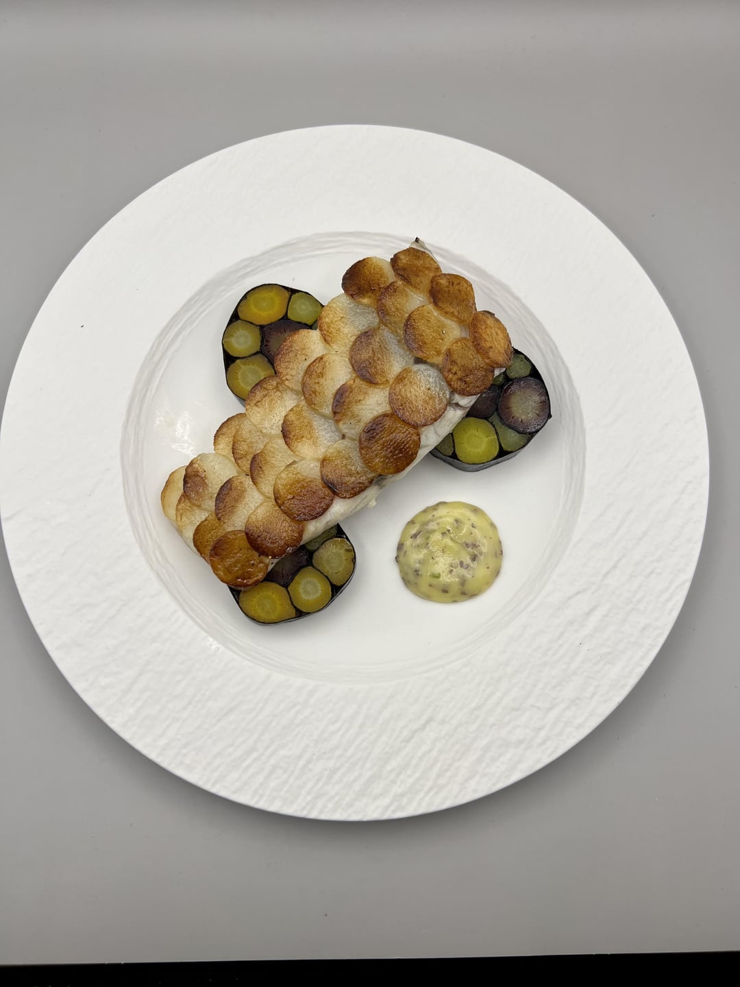
I like the first way a lot. The more organic hunk of potato rather than a neat rectangle, the elements are more spread out and have a little breathing room. Plus a darker plate helps the colors pop- the second is a bit washed out. Beautiful work!
knuckleduster12 on
Do I see Villeroy & Boch Manufacture Rock here? Stunningly beautiful! Oh and the plating as well, but don‘t take my advice on that, I‘m not a professional. 😀
glowupsusan on
Both mosaics are gorgeous, but they’re kind of overwhelming when in the same dish. Almost gives me trypophobia. I would go with something smoother for the carrots. That way you can also highlight the texture that you’ve managed to create with the potatoes!
AlienRemi on
You’ve executed everything well with good technique on display. It just doesn’t look like a delicious plate of food that I can’t wait to eat.
gotonyas on
Good techniques and idea but the execution is lacklustre. Scales are pretty bland colour, you want to try and pan fry/roast while pressing down with a weight in clarified butter and watch the cook, this would make the scales golden instead of brown-ish. They need some good colour not boring colour like that brown for sure
AshennJuan on
I love food but the crap on this sub is not food, it’s visual art with wasted ingredients. Peace
bingbop97 on
1st one, don’t fuck around to hard
Philly_ExecChef on
I like the concept but it needs to tighten up.
You’re doing intricate work and then overloading the plate.
Smaller, more specific barramundi cut, clean up the potato scales so they’re arranged more consistently (a photo is better than the second in terms of the scales).
One mosaic piece is better than three here, unless you’re slicing thinly. I get wanting to show off the mosaic, but the colors are bright enough that a single piece should be impressive.
I also feel like you’re missing a step on the seaweed butter. Maybe up that seaweed ratio and get a strong green, then a hard lateral swipe through it with an offset, something straight to contradict your organic and oval shapes, but reinforces your symmetry on the scales and mosaic.
lordpunt on
I’d go one mosaic add another element to the dish and then a sauce. The beginning of a nice dish.
Miserable_Ride666 on
Looks stunning to me, particularly on the slate. I need to research some techniques now
HolyPizzaPie on
2nd plating is better but I think the bytter should be a quinelle
NYEDMD on
Really nice! For the first, would simply switch the position of the butter with the middle carrot mosaic. Ideally (yes, this is nit-picking), the curve of the potatoes should match the curve of the plate and it should be a perfectly wedge or quarter. But even as is, you’ve got an 8 or 9/10. 👏🏼👏🏼👏🏼
tzulik- on
I’m just an amateur, but let me just say how awesome the mosaic looks.
The overall dish seems to be lacking that coherent harmony a little, but I love the mosaic.
UnclassifiedPresence on
Plating is fantastic, but I’m having trouble imagining the flavor profile. My brain is saying “potato carrot sushi roll with no rice or fish” and I can’t wrap my head around whether or not that would even taste good. Looks beautiful though, and mad respect for creativity.

16 Comments
Never seen a non-protein mosaic before. Could you explain how you accomplished that?
Some really cool techniques on display but something about it all just seems alien to me, like I’m not looking at actual food any more. Maybe lift the fish up a bit so that some is visible under the potato.
I love the carrot mosaic but in combination with the potato scale it’s making my eyes blur, maybe make the scale a different size?
I like the first way a lot. The more organic hunk of potato rather than a neat rectangle, the elements are more spread out and have a little breathing room. Plus a darker plate helps the colors pop- the second is a bit washed out. Beautiful work!
Do I see Villeroy & Boch Manufacture Rock here? Stunningly beautiful! Oh and the plating as well, but don‘t take my advice on that, I‘m not a professional. 😀
Both mosaics are gorgeous, but they’re kind of overwhelming when in the same dish. Almost gives me trypophobia. I would go with something smoother for the carrots. That way you can also highlight the texture that you’ve managed to create with the potatoes!
You’ve executed everything well with good technique on display. It just doesn’t look like a delicious plate of food that I can’t wait to eat.
Good techniques and idea but the execution is lacklustre. Scales are pretty bland colour, you want to try and pan fry/roast while pressing down with a weight in clarified butter and watch the cook, this would make the scales golden instead of brown-ish. They need some good colour not boring colour like that brown for sure
I love food but the crap on this sub is not food, it’s visual art with wasted ingredients. Peace
1st one, don’t fuck around to hard
I like the concept but it needs to tighten up.
You’re doing intricate work and then overloading the plate.
Smaller, more specific barramundi cut, clean up the potato scales so they’re arranged more consistently (a photo is better than the second in terms of the scales).
One mosaic piece is better than three here, unless you’re slicing thinly. I get wanting to show off the mosaic, but the colors are bright enough that a single piece should be impressive.
I also feel like you’re missing a step on the seaweed butter. Maybe up that seaweed ratio and get a strong green, then a hard lateral swipe through it with an offset, something straight to contradict your organic and oval shapes, but reinforces your symmetry on the scales and mosaic.
I’d go one mosaic add another element to the dish and then a sauce. The beginning of a nice dish.
Looks stunning to me, particularly on the slate. I need to research some techniques now
2nd plating is better but I think the bytter should be a quinelle
Really nice! For the first, would simply switch the position of the butter with the middle carrot mosaic. Ideally (yes, this is nit-picking), the curve of the potatoes should match the curve of the plate and it should be a perfectly wedge or quarter. But even as is, you’ve got an 8 or 9/10. 👏🏼👏🏼👏🏼
I’m just an amateur, but let me just say how awesome the mosaic looks.
The overall dish seems to be lacking that coherent harmony a little, but I love the mosaic.
Plating is fantastic, but I’m having trouble imagining the flavor profile. My brain is saying “potato carrot sushi roll with no rice or fish” and I can’t wrap my head around whether or not that would even taste good. Looks beautiful though, and mad respect for creativity.