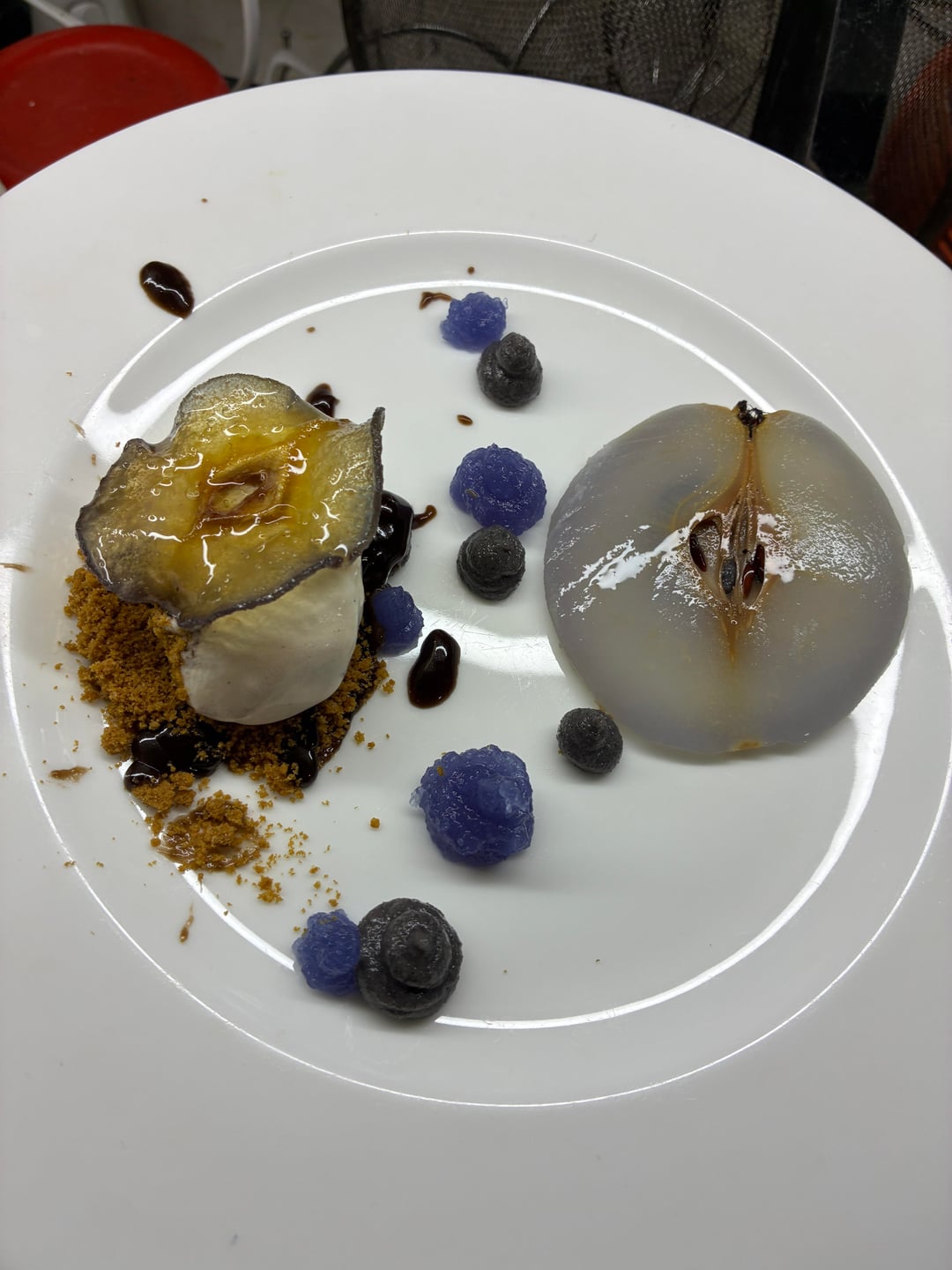
In theory, yes. In practice, there’s room for improvement. Starting with your gelée texture, it’s very thick, add simple syrup and blend it to achieve a better consistency. I’d like to see the pear slice to the right without the seed pocket.
Personally, I’d reimagine it to have the pear on the right be the bottom, fill in the seed pocket with your biscoff, add the black sesame paste around the hole to “seal” it, vanilla quenelle, and then your glass pear on top. Basically stack it and it’ll be more refined. Correct your gelée, and you can draw a nice design on the plate, or get better dots. I’d add a butterfly pea flower to the top of the dessert or on the side of the plate with the gelée design.
Good idea; this can easily be elevated with a few tweaks!
TurtleFondler on
Far too messy, redundant use of pears that you didn’t deseed. Gelees have an unpleasant looking consistency and were placed awkwardly without rhyme or reason. Can’t tell if you just wanted to hide the ugly looking quenelle with a glass pear but imo the entire point of a quenelle is to show it off, not obstruct it with something else. Flavor composition is there and I’m sure the majority of it tastes fine on its own but your vision of the plating makes no sense.
brownzilla999 on
Ignoring the plating, it just sounds like a bad flavor combination.
Fluid_Cauliflower237 on
The right side with the middle and something less moist- looking on the left would help.
markusdied on
okay all the other things that others have said aside, question:
What flavor is butterfly pea gel?
(this is rhetorical)
there is no reason to have this in a dish, let alone on the plate in dots, when it tastes like and does absolutely nothing besides being a blue component
tacocollector2 on
The colors are incredibly off putting.
Stunning-Tourist-332 on
You really like blue…don’t ya?
norobo132 on
All I can think of is the face hugger’s from alien…
Diligent-Landscape77 on
Frank Reynolds would love this
meggienwill on
That gelee looks rough my guy…. some decent pieces here but looks pretty ridiculous as is
BuffetAnnouncement on
For me a lot of the comments regarding questionable flavor combinations are cynical since we can’t actually taste the dish. Yeah the gelee is lumpy and butterfly pea doesn’t offer much besides purple but I like the complimentary color scheme and different opacities on the plate, and I don’t think there’s anything inherently wrong with the flavors you’ve put together. Does it taste good?
No_Start2717 on
Get the fuck away from me
cheezit_baby on
Glass pear is beautiful! Everything else probably needs to be rethought.
The texture of your Gelee and paste can be easily fixed with more liquid.
Also wipe your plates. The chocolate and biscoff on the rim makes it look super messy
InfiniteBuddy on
everything reminds me of her…
jerricka on
Inspiration taken from Georgia O’Keefe?
jg123224 on
Are we using the core these days?
LionBig1760 on
This looks like the color people’s skin gets after drowning and being waterlogged for 3 days.
The rest looks like deer pellets.
But there is a “quenelle” in there, so you checked that box.
StrangeArcticles on
The main problem I’m seeing here is that my eye isn’t really drawn to anything. There’s no clear focal point, so what stands out instead are the imperfections.
Rethink rhis plate. What single element do you want the customer to look at and what are you doing to orchestrate that? The easiest way to force it is by putting that item in the center, ideally at a bit of a height, and then work around it with your other bits.
That central element needs to be spotless. If we’re picking the pear, make it look perfect. Deseed it. Settle on the size you want. Don’t offer two different versions that both aren’t quite right.
Show me your quenelle. Fix the chocolate so it doesn’t look like salad guy slipped with the balsamic reduction. Be intentional and treat every ingredient right, the end result is always going to be untidy if you don’t.
semantic_satiation on
This is some sci-fi ass shit
OkFlamingo844 on
Did you not take a look at this prior to posting/plating or even try your components and cross reference with how these techniques look on YouTube videos or Instagram and not come to a conclusion that this is completely off target?
(The answer is no, you didn’t)
Otherwise-Tip-127 on
This is gorgeous. Gelee could be more smooth but the glass pear is a stunner.
Auto_Phil on
This kinda looks like it fell on the plate
DruidDude_95 on
Interesting. What other fruits can be made into this “glass” effect? I’m assuming apples and other fruits of that texture?
BostonFartMachine on
This missed the target. Actually no. It was a misfire. Didn’t even clear the barrel.
It is too much actual mess not enough “intentional mess”, i.e. making something look messy that was actually done on purpose, well.
mahboilucas on
Damn some of you don’t even want to give critique and just opt for being nasty.
Learn some manners and CONSTRUCTIVE critique because you don’t sound professional yourselves
HsiaoTwo on
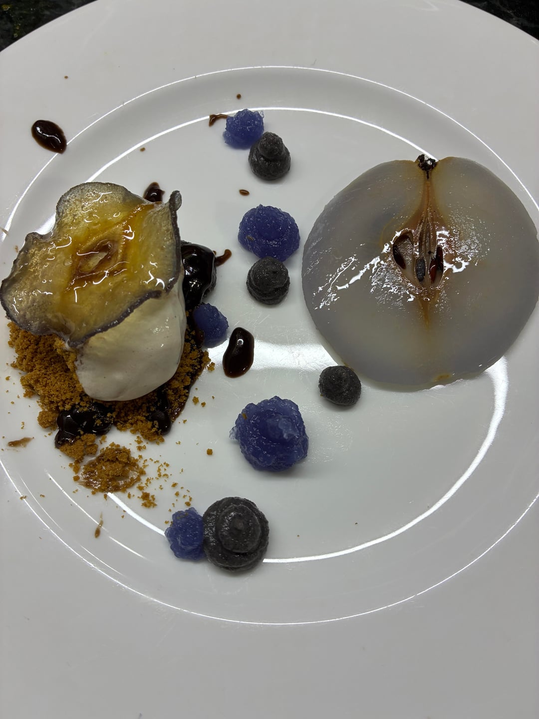
I’m just curious why we are shown two pictures at nearly the same angle, did I miss something?
weaponized_ideas on
Lotsa people seem to hate the plating from what I read, however I find that it’s lovely and I’d try it just because it looks interesting and not dull.
Is it perfect? No, but colors and interesting choices await your taste buds for something not normally on my dessert plate
Big-Fill-4250 on
I mean. Percy Jackson’s mom would love it
craptasticluke on
I’m too poor to understand what I’m looking at.
lickety_split_69 on
good elements, keep practicing. everything looks way too spread out, that gelee could definetly look a little less like blended jell-o, avoid the rim of the plate when plating, the sauce on the edge looks messy, and if you want to quenelle try keeping your product colder and spoons warmer, and again practice practice practice.

32 Comments
There’s still time to delete this…
Nope. Just you can doesn’t mean you should.
In theory, yes. In practice, there’s room for improvement. Starting with your gelée texture, it’s very thick, add simple syrup and blend it to achieve a better consistency. I’d like to see the pear slice to the right without the seed pocket.
Personally, I’d reimagine it to have the pear on the right be the bottom, fill in the seed pocket with your biscoff, add the black sesame paste around the hole to “seal” it, vanilla quenelle, and then your glass pear on top. Basically stack it and it’ll be more refined. Correct your gelée, and you can draw a nice design on the plate, or get better dots. I’d add a butterfly pea flower to the top of the dessert or on the side of the plate with the gelée design.
Good idea; this can easily be elevated with a few tweaks!
Far too messy, redundant use of pears that you didn’t deseed. Gelees have an unpleasant looking consistency and were placed awkwardly without rhyme or reason. Can’t tell if you just wanted to hide the ugly looking quenelle with a glass pear but imo the entire point of a quenelle is to show it off, not obstruct it with something else. Flavor composition is there and I’m sure the majority of it tastes fine on its own but your vision of the plating makes no sense.
Ignoring the plating, it just sounds like a bad flavor combination.
The right side with the middle and something less moist- looking on the left would help.
okay all the other things that others have said aside, question:
What flavor is butterfly pea gel?
(this is rhetorical)
there is no reason to have this in a dish, let alone on the plate in dots, when it tastes like and does absolutely nothing besides being a blue component
The colors are incredibly off putting.
You really like blue…don’t ya?
All I can think of is the face hugger’s from alien…
Frank Reynolds would love this
That gelee looks rough my guy…. some decent pieces here but looks pretty ridiculous as is
For me a lot of the comments regarding questionable flavor combinations are cynical since we can’t actually taste the dish. Yeah the gelee is lumpy and butterfly pea doesn’t offer much besides purple but I like the complimentary color scheme and different opacities on the plate, and I don’t think there’s anything inherently wrong with the flavors you’ve put together. Does it taste good?
Get the fuck away from me
Glass pear is beautiful! Everything else probably needs to be rethought.
The texture of your Gelee and paste can be easily fixed with more liquid.
Also wipe your plates. The chocolate and biscoff on the rim makes it look super messy
everything reminds me of her…
Inspiration taken from Georgia O’Keefe?
Are we using the core these days?
This looks like the color people’s skin gets after drowning and being waterlogged for 3 days.
The rest looks like deer pellets.
But there is a “quenelle” in there, so you checked that box.
The main problem I’m seeing here is that my eye isn’t really drawn to anything. There’s no clear focal point, so what stands out instead are the imperfections.
Rethink rhis plate. What single element do you want the customer to look at and what are you doing to orchestrate that? The easiest way to force it is by putting that item in the center, ideally at a bit of a height, and then work around it with your other bits.
That central element needs to be spotless. If we’re picking the pear, make it look perfect. Deseed it. Settle on the size you want. Don’t offer two different versions that both aren’t quite right.
Show me your quenelle. Fix the chocolate so it doesn’t look like salad guy slipped with the balsamic reduction. Be intentional and treat every ingredient right, the end result is always going to be untidy if you don’t.
This is some sci-fi ass shit
Did you not take a look at this prior to posting/plating or even try your components and cross reference with how these techniques look on YouTube videos or Instagram and not come to a conclusion that this is completely off target?
(The answer is no, you didn’t)
This is gorgeous. Gelee could be more smooth but the glass pear is a stunner.
This kinda looks like it fell on the plate
Interesting. What other fruits can be made into this “glass” effect? I’m assuming apples and other fruits of that texture?
This missed the target. Actually no. It was a misfire. Didn’t even clear the barrel.
It is too much actual mess not enough “intentional mess”, i.e. making something look messy that was actually done on purpose, well.
Damn some of you don’t even want to give critique and just opt for being nasty.
Learn some manners and CONSTRUCTIVE critique because you don’t sound professional yourselves
I’m just curious why we are shown two pictures at nearly the same angle, did I miss something?
Lotsa people seem to hate the plating from what I read, however I find that it’s lovely and I’d try it just because it looks interesting and not dull.
Is it perfect? No, but colors and interesting choices await your taste buds for something not normally on my dessert plate
I mean. Percy Jackson’s mom would love it
I’m too poor to understand what I’m looking at.
good elements, keep practicing. everything looks way too spread out, that gelee could definetly look a little less like blended jell-o, avoid the rim of the plate when plating, the sauce on the edge looks messy, and if you want to quenelle try keeping your product colder and spoons warmer, and again practice practice practice.