
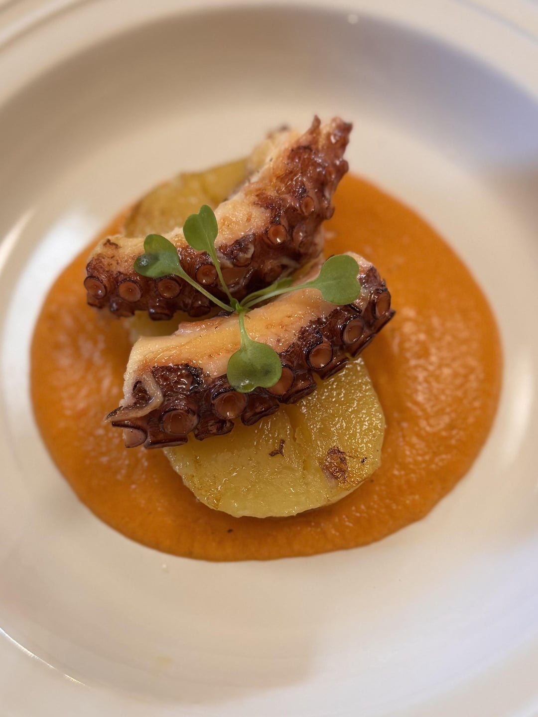
Hey yall, I’m curious on your thoughts on the color balance in the plate. I think it works but something could be changed to be better.
Please ignore the “rushedness” of the plating, I was a one man show in a tiny kitchen cooking for ten people on an actual whim. Yes I know I wish there was better browning on the potato, and that might be the color balance fix, I’m not sure. Let me know thanks!
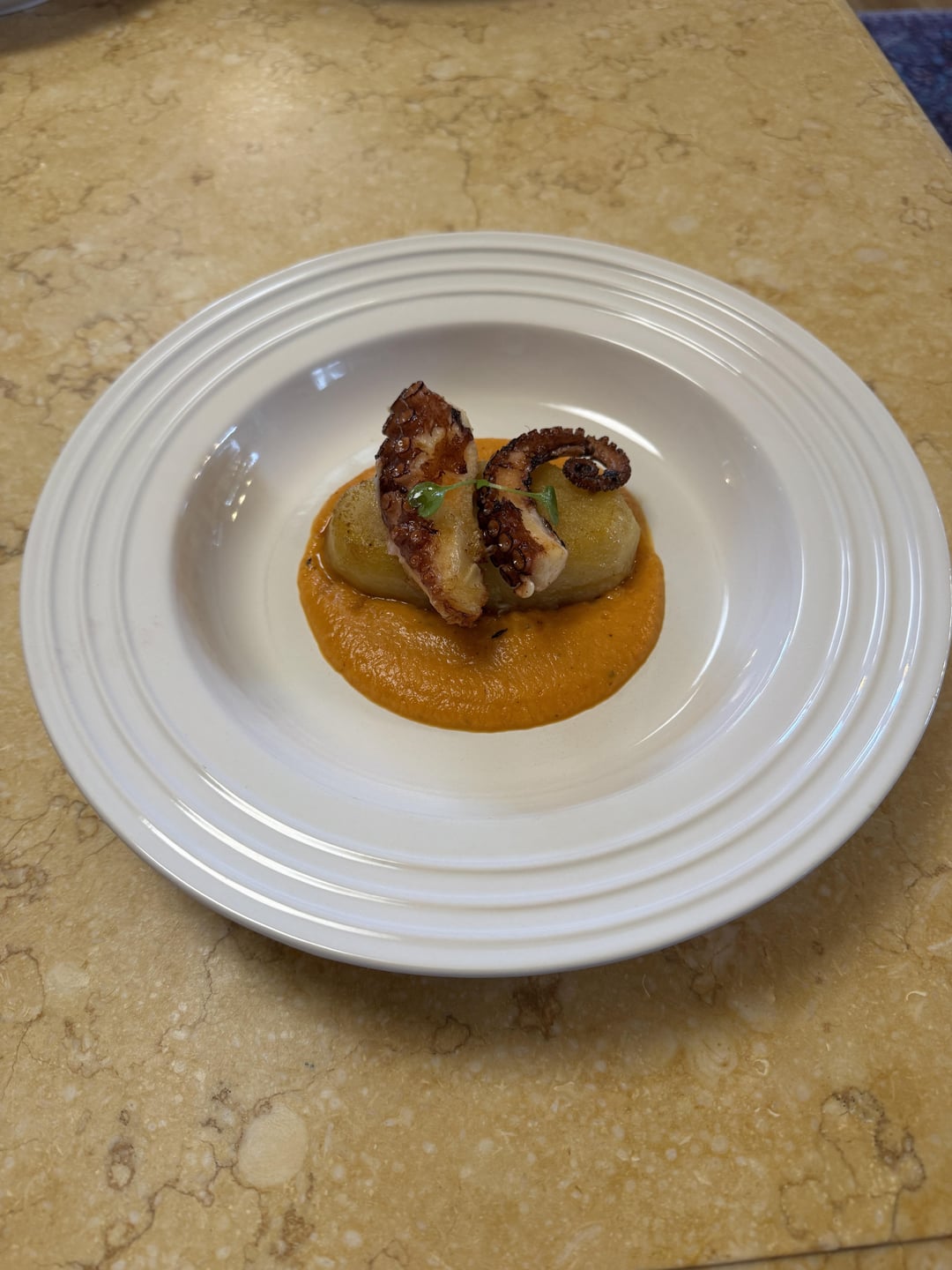
Btw, it was damn good. Braised octopus pan seared served over a braised Yukon gold potato in a charred red pepper sauce
by Prestigious-Monk5743
5 Comments
I’m just a high amateur but color wise maybe a white sauce, a few dots in the puree. Maybe a little more green, turn that into a very small salad or something. I think more leafy greens would go well taste-wise. What about a wide black ink sauce strip going through the middle of the plate under the puree? That would give contrast in color and shapes by adding lines.
Not what you asked but I think swapping out the potato for croquettes would be fire and add crunch.
Looks very appetizing to me as is, though.
I quite like it as it is. The other commenter has some great points but wondering if something pink/red could look nice. Perhaps something pickled as a garnish, a pink sauce that you could dropper kind of?
I would leave it intact and add some cress on top or something like that
I did a octopus w/“fava” puree (a classic santorini dish) my plating (you can see in my post history) lacked any sophistication and the puree was not as smooth as this one, but I think there was more contrast due to the char. I think what you have here just needs some more color contrast. And I’m sure it was divine.
I’d think that the yellows would be well served by a dark blue plate.