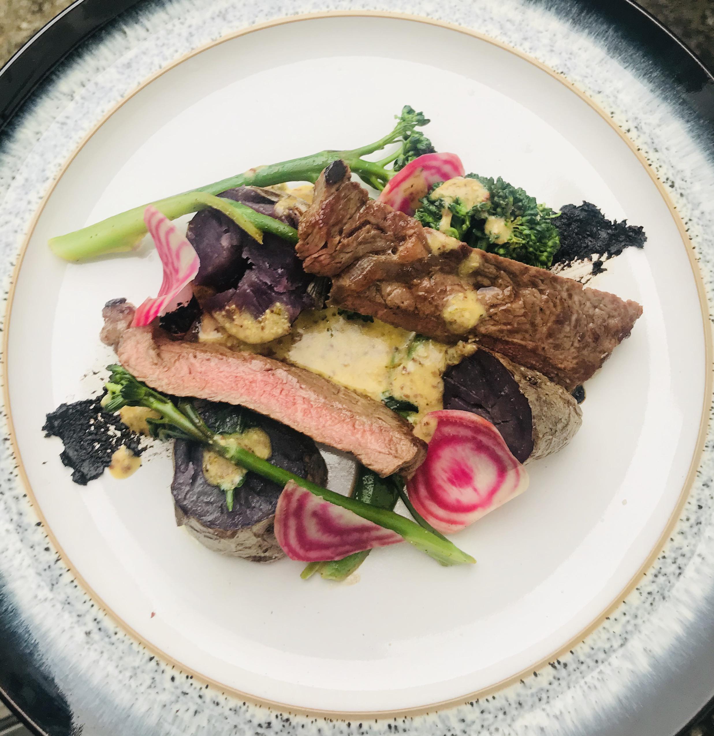
Visually this is quite unappealing, perhaps pull back a bit and go brush up on some design fundamentals.
ChefPneuma on
Sometimes showing “the cut and the cook” on a protein like you did here works well, but I’m this instance I think you would have been better served slicing that steak for presentation.
Maybe tighten up the presentation and not have so many elements scattered around.
Keep practicing and you will get there. I see what you were going for with this, and I think with some more experience you’ll be just fine
ihavethoughtsnotguts on
I would bet this photo is a little washed out and you have much better colors than you’re getting credit for.
Sillysilssss on
I think the main focus on any dish needs to be how it gets eaten before presentation. I don’t think this looks too bad just a little involved and I think it would be hard to eat in a cohesive manner.

4 Comments
Visually this is quite unappealing, perhaps pull back a bit and go brush up on some design fundamentals.
Sometimes showing “the cut and the cook” on a protein like you did here works well, but I’m this instance I think you would have been better served slicing that steak for presentation.
Maybe tighten up the presentation and not have so many elements scattered around.
Keep practicing and you will get there. I see what you were going for with this, and I think with some more experience you’ll be just fine
I would bet this photo is a little washed out and you have much better colors than you’re getting credit for.
I think the main focus on any dish needs to be how it gets eaten before presentation. I don’t think this looks too bad just a little involved and I think it would be hard to eat in a cohesive manner.